Movie Posters That Are Almost As Good As The Movies Themselves!
Creating the perfect movie poster is harder than it looks. It’s not just a matter of taking still shots of characters and Photoshopping them all together until they look mysterious and dramatic. The best posters are able to visually capture the essence of a movie without presenting an image that is too cliché or cluttered. Forgetting the fact that designing posters is an art and that a good poster can make or break a movie, many film studios settle for the overused “lone character walking off into the sunset” pose or the “group photo with every character’s face slightly obscured,” or, my favorite, “the back-to-back buddy shot.” Other studios put more effort into their posters, producing images that I would gladly plaster all across my bedroom. Here’s just a few of the best.
Singin’ in the Rain
Every time I look at this picture, I smile. I can’t help it. I think the poster has some weird power over people that come into contact with it. Singin’ in the Rain is a classic film that promotes a positive message about love and umbrellas. (I think? It’s been a while since I last saw it.) The poster perfectly encapsulates that idea, while reminding us all how cheery the 1950s were.
Jaws

Any scary movie fanatic knows that the scariest films are the ones where the “villain” or threat is invisible. What our mind creates in those gaps is what scares us the most. Jaws is the perfect example. When the mechanical shark malfunctioned at the beginning of filming, Steve Spielberg was strapped for cash and desperate for options. Rather than try to fit the machine into every take, Spielberg cut the shark out of many of the scenes entirely, using eerie music and underwater POV shots to create the illusion of a shark attack. The film’s poster, which shows a shark under the water approaching a swimmer, reminds us all that it is the anticipation of the attacks, not the attacks themselves, that made the film terrifying.
Titanic
What was the only thing standing in the way of Jack and Rose’s love affair, besides their class difference and the lack of lifeboats at the end of the film? That’s right, the Titanic and its catastrophic crash into the iceberg. And what does the poster place directly in the center, almost bisecting the couple who stand intertwined in the background? The Titanic. Maybe I’m reading a bit too much into the mise-en-scene, but it seems as though the boat has been painted as the villain here. In fact, it’s even in the same position as the shark from the Jaws photo, coming from the bottom of the poster to attack its prey at the top. I see what you did there, James Cameron. I see you.
Mean Streets
To be honest, I hated Mean Streets. Martin Scorsese’s choppy editing techniques hurt my brain, and half the time, I hardly know what’s going on. That being said, I love the poster for this movie. Not only is it artsy, but it integrates the film’s two main themes: violence and the city. I mean, the gun actually looks like a building at first glance.
I’m a fan of simplicity. I think you can get an idea across and intrigue your audience with a simple image or logo. The original poster for Jurassic Park acts as a perfect example. What the poster lacks in content (only the film’s name and dinosaur logo are shown), the tagline makes up for with its mysterious declaration: “An adventure. . . 65 million years in the making.” We know it’s about dinosaurs. We know it’s an adventure movie. What else do we need?
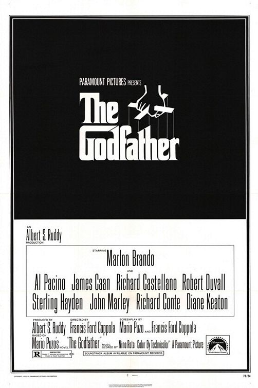
The Godfather
 Again with the simplicity. We’ve got the recognizable and iconic font mixed with the simple picture of a hand controlling the letters like puppets. The darkness surrounding the title hints at a dark, dangerous plot and the puppetmaster idea suggests manipulation and scheming. Sometimes the simplest answer is the best one.
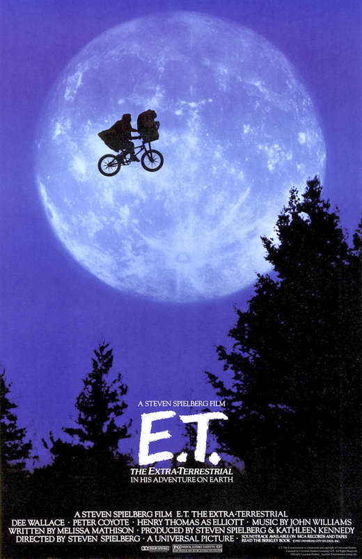
E.T.
If a shot of a flying bicycle doesn’t immediately spark your interest, then I don’t know what would. Seriously, what are you looking for? Cats? Guns? Cats with guns? I’m sorry, but you’re starting to sound pretty unreasonable. This poster is perfect. The moon in the background mixed with the flying silhouette combines the human world with the “extraterrestrial” world, just like the film itself.
Fargo
What better way to advertise a mystery thriller that happens in the most mundane environment than to present a murder scene on a piece of quilt? The image of the dead body is offset by the unthreatening design, leaving you feeling intrigued but confused, which is how you will feel while watching the actual movie.
Little Miss Sunshine

Little Miss Sunshine is a film about a quirky family working together to travel across the country for a beauty pageant. Just like the car they travel in, the family is “on the verge of a breakdown,” which the poster portrays nicely using very little editing.
Eternal Sunshine of the Spotless Mind

If you haven’t watched Eternal Sunshine of the Spotless Mind, I feel bad for you, mostly because you have not yet experienced the joy of watching Jim Carrey be a serious actor. In this indie drama, a heartbroken man tries to erase the memory of his lover, only to realize halfway through that he’d rather have loved and lost than never loved her at all. The cracked surface of the ice that the pair lay on in the poster and the faded color of the ice and the movie title itself capture this idea perfectly.
(Featured image via JimHillMedia.com, posters via IMDB.)
Source: Tyler Vendetti via Hello Giggles
Alissa Fairchild > Twitter


